
This page is in progress -
Why This is Important
Large buttons (44 px) are accessible for people with physical disabilities who have dexterity needs.
Blind and visually impaired people use screen readers to interact with websites and apps. A screen reader is a type of assistive tech that converts things on screen to audio and/or braille. It's important that things are understandable and interactive to screen readers.
Keyboard accessibility is essential for people who do not use a computer mouse (which might be because they have unpredictable or very specific movement due to a motor disability). Many Blind and visually impaired people also use keyboard interactions in order to use their screen reader.
Error support is accessible to people with a diversity of disabilities. A cognitive disability might affect how a person perceives and understands things. A physical disability might lead to unpredictable movement. Other factors such as environment, stress, and multi-tasking may also lead to errors.
In order to be accessible, gestures and interactions must account for people with physical and motor disabilities, who might have unpredictable or very specific movement.
Large buttons are both easier to see and interact with. When people interact with small buttons, it's very likely they might accidentally miss the button or click on the wrong button, especially if they have a motor disability that affects their movement, such as paralysis or cerebral palsy.
This references WCAG criterion 2.5.5 Target Size (Level AAA).
Level AAA compliance is considered more difficult to meet because it requires more resources to fulfill. It also might encompass conflicting access needs (meaning what is accessible to some might be inaccessible to others). Use your best judgment of your target audience and your team's capabilities to determine if this is a pragmatic goal to reach.
How to Implement This
WCAG 2.1 recommends a target size of at least 44 x 44 pixels. However, the button can be smaller in the following scenarios:
- Equivalent - there is another button that serves the same purpose and is at least 44 x 44 pixels
- Inline - it's a link in a block of text
- User agent control - the size of the button is set by the user
- Essential - a certain presentation is essential
Target Size
There are a couple ways you can accomplish a large target size.
You can expand the size of the entire button so that it’s at least 44px wide in one direction. Sometimes, that might make the button look overwhelming, especially for icons. You can also make the button smaller but keep the target size large by using a link area or increasing the padding around the button.

Buttons for Touch Screens
Even though large buttons are only required for WCAG level AAA, this rule becomes more critical when designing for a touch screen, such as a phone or tablet.
Human fingers are larger than a computer mouse. People who don't use a screen reader or keyboard typically don't tab through all the buttons on screen. Therefore, it’s important that buttons on mobile are large enough to accommodate the human error that could come with fingers and hand movement.
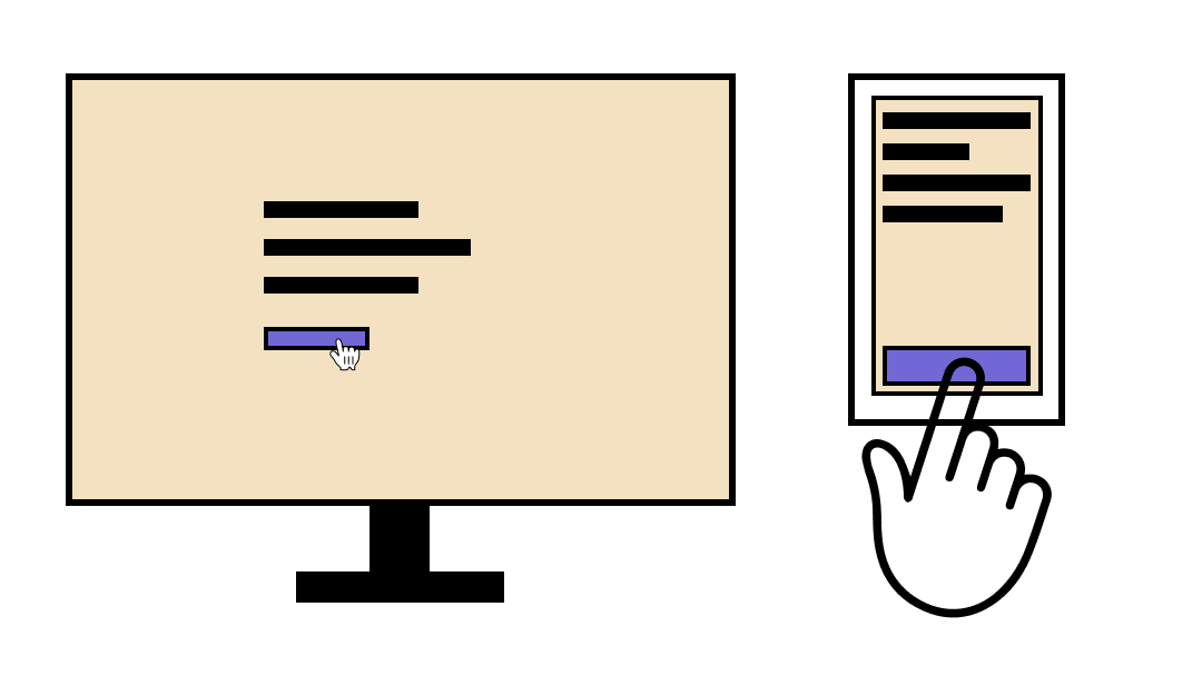
Additionally, think about button placement on mobile. Smartphones are increasingly getting bigger and bigger. A human thumb can usually access the lower region of the phone. However, it gets increasingly difficult to access buttons at the top.
Interesting Further Reading
- NN: Touch Targets on Touchscreens
- Finger-Friendly Design: Ideal Mobile Touchscreen Target Sizes
- Button design for websites and mobile apps
How to Test This
- The Android Accessibility Checker can automatically scan for buttons and suggest those that need larger touch target sizes.
- The Adee plugin can test for button sizes across multiple devices on Figma and Sketch.
- On computer browsers, use chrome inspect tools to manually inspect the size of the touch target.