This page is in progress -
Why This is Important
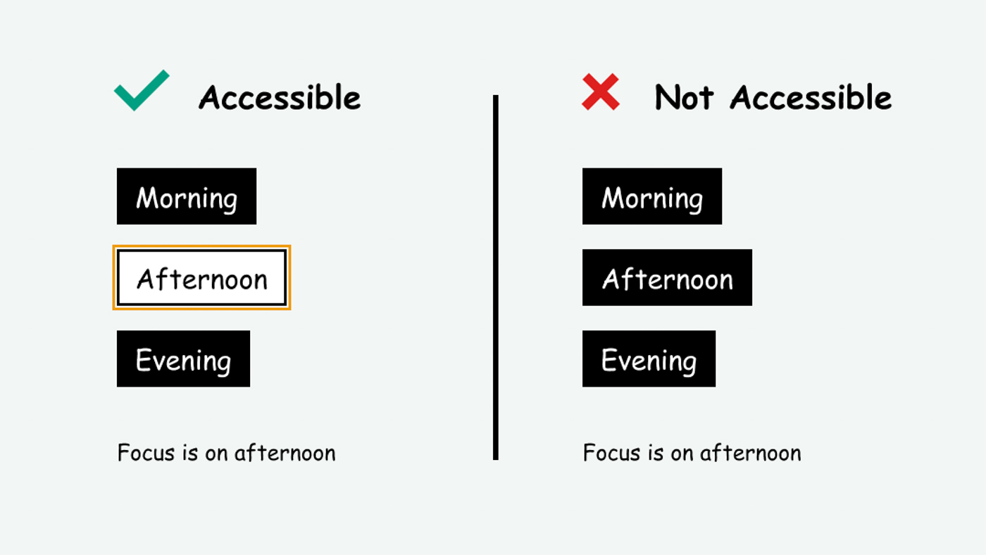
A visible focus indicator is accessible to keyboard and screen reader users because it shows what they're interacting with.
Blind and visually impaired people use screen readers to interact with websites and apps. A screen reader is a type of assistive tech that converts things on screen to audio and/or braille. It's important that things are understandable and interactive to screen readers.
Keyboard accessibility is essential for people who do not use a computer mouse (which might be because they have unpredictable or very specific movement due to a motor disability). Many Blind and visually impaired people also use keyboard interactions in order to use their screen reader.
Error support is accessible to people with a diversity of disabilities. A cognitive disability might affect how a person perceives and understands things. A physical disability might lead to unpredictable movement. Other factors such as environment, stress, and multi-tasking may also lead to errors.
In order to be accessible, gestures and interactions must account for people with physical and motor disabilities, who might have unpredictable or very specific movement.
When an interactive element receives focus, that means it’s ready for user input (for example, a button is ready to be pressed or a text input is ready for text). Keyboard users tab through interactive elements, moving focus from one element to another without using their mouse. The focus indicator must be visible so that it’s clear what element the user is interacting with.
A visible focus indicator also helps people with executive dysfunction and other vision or processing related issues (light sensitivity, headaches and migraines, etc.) because it draws attention to one thing at a time. This helps reduce the cognitive load.
This references WCAG criterion 2.4.7 Focus Visible (Level AA).
Level AAA compliance is considered more difficult to meet because it requires more resources to fulfill. It also might encompass conflicting access needs (meaning what is accessible to some might be inaccessible to others). Use your best judgment of your target audience and your team's capabilities to determine if this is a pragmatic goal to reach.
How to Implement This
Avoid Overriding the Browser’s Default Focus Indicator
Sometimes, in the effort to make a clean and elegant looking website, people might get rid of the focus indicator by setting the CSS outline property to “none.” Unless you have plans to replace this with custom styling, please do not remove this as you would be removing critical keyboard access!
Design Accessible Hover and Focus States
All interactive elements need hover and focus states. This includes buttons, links, text fields, navigation elements, selection items (radio buttons, checkboxes), etc. Interactive elements encompass any element that the user can interact with.
While hover and focus states are sometimes treated the same, they actually serve different purposes.
A hover state lets you know something is interactive. If you use a mouse, you can move your mouse over the screen and get a sense of what you can interact with when things are highlighted on hover.
A focus state indicates that an element is ready to receive input. This is different from hover because it’s communicating “you are interacting with this right now” instead of “you could potentially interact with this.” For example, a text field is ready for you to add text.
Other common states include error, loading, and inactive* states. It's important to design for all of these states because they help people understand what they're interacting with.
*Inactive - it's industry standard to refer to UI elements as “disabled” when users can't interact with them due to the setup of certain settings. To be inclusive of the identity-first movement, I try to avoid using “disabled" and use "inactive" instead. Keep in mind that "disabled" is still the official CSS pseudo class.
Example - Buttons
Here is an example of default, hover, focus, and inactive states for buttons. Primary buttons are for important or commonly used actions and secondary buttons are for less important actions.
To satisfy this guideline, it's critical that the focus indicator is visibly noticeable, especially to those with low vision. Take into account the focus indicator's contrast both against the button and the background. Also, keep in mind that the page background color may change depending on where the button is placed.
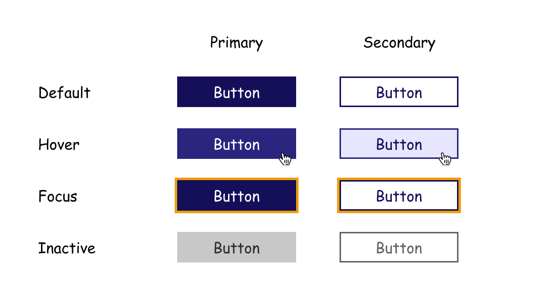
For this button, the focus state is a thick yellow outline. The yellow has a contrast of 5.51 against dark purple and 3.04 against white. Both of these pass the WCAG requirement for all UI components to have a 3:1 contrast ratio.
CSS for the primary button:
button {
background: #150F5A;
}
button:focus {
border: 5px solid #CC8405;
}
button:hover {
background: #2C2580;
}
button:disabled {
background: #C8C8C8;
}
Interesting further reading
How to Test This
Perform a manual keyboard test by pressing the tab key to see if the focus indicator is always present and visible.
To enhance keyboard testing, you can use these tools recommended by Nic Chan in Smashing Magazine.
Check the color contrast to ensure the color is accessible in contrast to the element and/or background using a contrast checker such as Stark for Chrome.