This page is in progress -
Why This is Important
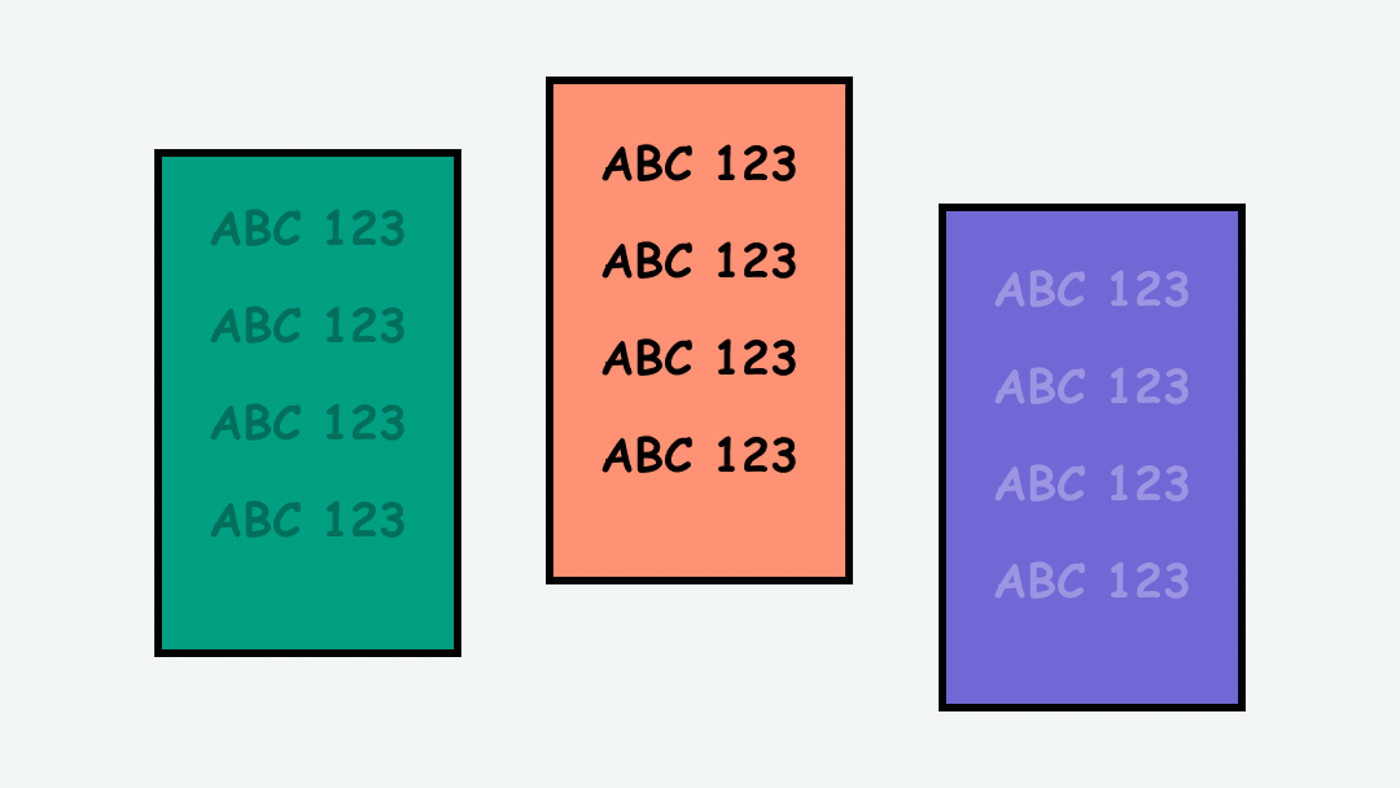
High contrast makes text and UI elements easy to read and understand. It is primarily for people with low vision and reading disorders.
Blind and visually impaired people use screen readers to interact with websites and apps. A screen reader is a type of assistive tech that converts things on screen to audio and/or braille. It's important that things are understandable and interactive to screen readers.
Keyboard accessibility is essential for people who do not use a computer mouse (which might be because they have unpredictable or very specific movement due to a motor disability). Many Blind and visually impaired people also use keyboard interactions in order to use their screen reader.
Error support is accessible to people with a diversity of disabilities. A cognitive disability might affect how a person perceives and understands things. A physical disability might lead to unpredictable movement. Other factors such as environment, stress, and multi-tasking may also lead to errors.
In order to be accessible, gestures and interactions must account for people with physical and motor disabilities, who might have unpredictable or very specific movement.
Especially considering that a significant amount of people have some sort of vision correction, high contrast benefits anyone who experiences content visually.
According to WCAG, the text contrast needs to be at least 4.5 to pass AA and at least 7.0 to pass AAA. Some people have given me feedback that they really prefer at least 10.0 or higher. The contrast of other elements, such as buttons and diagrams, needs to be least 3.0 to pass AA.
This references WCAG criteria 1.4.3 Contrast (Minimum) (Level AA), 1.4.6 Contrast (Enhanced) (Level AAA), 1.4.11 Non-Text Contrast (Level AA).
Level AAA compliance is considered more difficult to meet because it requires more resources to fulfill. It also might encompass conflicting access needs (meaning what is accessible to some might be inaccessible to others). Use your best judgment of your target audience and your team's capabilities to determine if this is a pragmatic goal to reach.
How to Implement This
Use a color contrast checker and check the contrast of everything.
Setting Colors and Checking Contrast
Use a color contrast checker in the design stages. Here are some contrast checkers in my preferred tool (Figma):
- Figma - A11y - Color Contrast Checker
- Figma - Able - Friction free accessibility
- Figma - Stark | The suite of integrated accessibility tools
There are a few important things to keep in mind with certain colors:
- Make sure the accent color is high contrast, as this is used for buttons and links
- Make sure the body text is high contrast, as this will account for most of the content
- Make sure status and error messages are high contrast, as they contain important information
Sometimes, the value of the brand colors that you are expected to use are mid-tone values (meaning on a spectrum of black to white, the value is similar to the grey in the middle). This is difficult to work with because mid-tone values tend to have low contrast with other colors. In these cases, I recommended generating a series of tints of the same color. This will provide light and dark versions that you can use.
For graphics, I recommend a tool called Colorable (my favorite contrast checker!). Colorable allows you to change the hue, saturation, and lightness of the colors. If you are dedicated to a color but the contrast is almost there, those sliders help make some tweaks (not a paid endorsement).
Button contrast
Potentially the most confusing contrast rule has to deal with buttons because you need to account for both the contrast of the button against the background and the text against the button. In some cases, perhaps the contrast of the button text is sufficient, but the contrast between the button background and the page background is not.
One simple way to approach button contrast is to use opposite colors. Use light text with a dark button and a light background. Or vice versa, dark text with a light button and a dark background. Even if the text and background are not the exact same color, matching light-dark-light or dark-light-dark helps ensure the contrast accessibility.
It's unclear if "ghost buttons" (for example, dark text on a light button on a light background) are officially considered accessible by WCAG. If the text is a noticeable accent color and there are accessible hover and focus styles, then I consider the button accessible. If you have any insights, please fill out the form below.
Other tools
These are some color contrast tools that I like but don't use as often:
How to Test This
- Use automated testing tools such as Deque Axe, IBM Accessibility Checker, and tota11y to test for color contrast. (tota11y is my preferred method to check contrast)
- Note - these tools cannot detect contrast between text and image. For that, use the Stark plugin (Chrome) to manually grab the colors to compare.