This page is in progress -
Why This is Important
If something requires user input, descriptive labels and instructions are needed so that people understand what to input. The labels should be clear for cognitively disabled folks and available to screen readers for Blind and visually impaired people.
Blind and visually impaired people use screen readers to interact with websites and apps. A screen reader is a type of assistive tech that converts things on screen to audio and/or braille. It's important that things are understandable and interactive to screen readers.
Keyboard accessibility is essential for people who do not use a computer mouse (which might be because they have unpredictable or very specific movement due to a motor disability). Many Blind and visually impaired people also use keyboard interactions in order to use their screen reader.
Error support is accessible to people with a diversity of disabilities. A cognitive disability might affect how a person perceives and understands things. A physical disability might lead to unpredictable movement. Other factors such as environment, stress, and multi-tasking may also lead to errors.
In order to be accessible, gestures and interactions must account for people with physical and motor disabilities, who might have unpredictable or very specific movement.
User inputs include components like text inputs, checkboxes, dropdown menus, etc. These are things that the user can interact with and assign a value. If the input does not have a label, or if the label is unclear, then the user might be confused about what to input. If the label is not available to screen readers, then that is inaccessible to Blind and visually impaired people.
This references WCAG criterion 3.3.2 Labels or Instructions (Level A).
Level AAA compliance is considered more difficult to meet because it requires more resources to fulfill. It also might encompass conflicting access needs (meaning what is accessible to some might be inaccessible to others). Use your best judgment of your target audience and your team's capabilities to determine if this is a pragmatic goal to reach.
How to Implement This
There are a few different aspects of an accessible label - the visual styling, the writing, and the screen reader markup.
Visual Styling
There has been a trend recently to use placeholder text as the label. While the intent is great (to create a clean, simple interface and save space) the result is actually confusing because the placeholder disappears after the user starts typing. Users might forget what type of information they're supposed to enter, especially if it's a long form with many inputs. Placeholder text might also be mistaken for a filled input when it's actually empty.
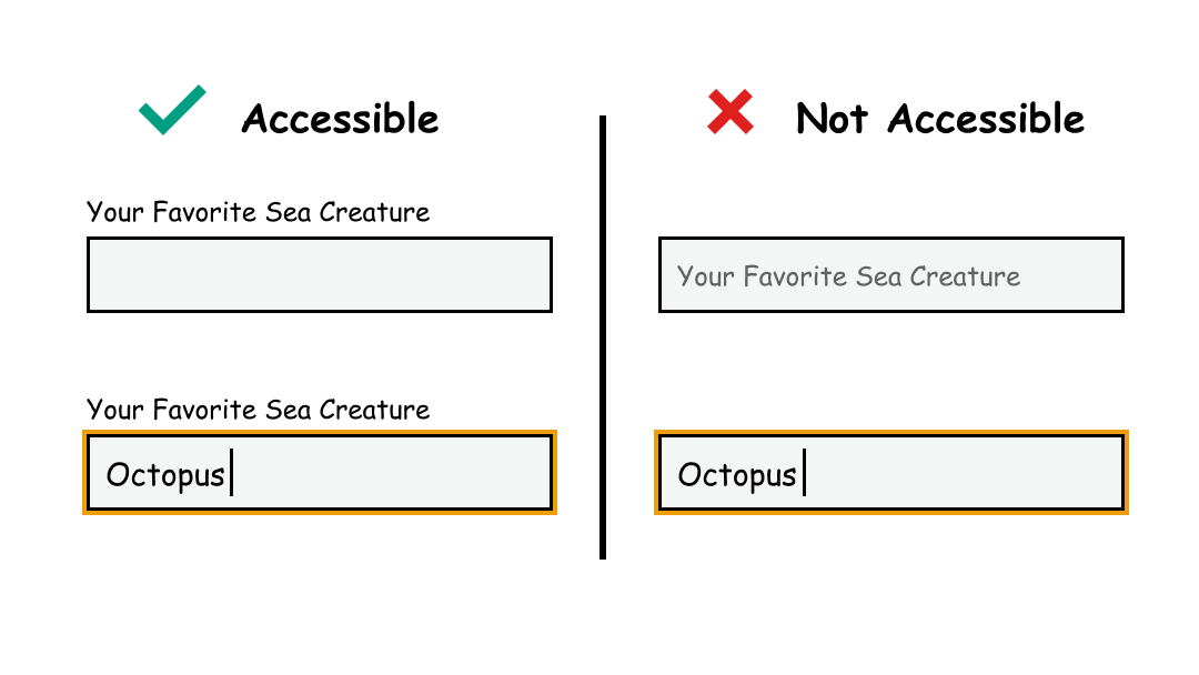
A conventional design with a static label above the user input is ultimately the best option. Adam Silver explains why that is in his scathing article Material Design text fields are badly designed. Conventional labels are easy to read and available at all times. And while I think the desire to be creative and push aesthetics should definitely be nurtured, there are other areas where this can be used more effectively.
Writing
Writing clear and descriptive labels requires skill in UX (User Experience) writing and writing micro-copy. Usually when people think of copywriting they think of long pieces of text (such as blog posts, editorials, articles, etc.) Micro-copy refers to the small pieces of text throughout the application - labels, buttons, titles, etc.
Here are some resources on writing micro-copy for labels:
- How to write labels for menus, buttons and other UI short texts
- 16 Rules of Effective UX Writing
- UX Writing: Handy Tips on Text Improving User Experience
Screen Reader Markup
The label of the input should also be annotated in markup so that it's available to screen readers. The input needs an id that the label refers to. This direct connection helps the screen reader understand what the label is for. It's important that the id is unique. Refer to Make sure that assistive tech can parse content for more information.
Here is an example from MDN: Basic form hints (with a fun little magic twist):
<form>
<ul>
<li>
<input id="magic-1" type="checkbox" value="dungeons-and-dragons"/>
<label for="magic-1">Dungeons and Dragons</label>
</li>
<li>
<input id="magic-2" type="checkbox" value="sabrina"/>
<label for="magic-2">Sabrina the Teenage Witch</label>
</li>
<li>
<input id="magic-3" type="checkbox" value="gob"/>
<label for="magic-3">A Magician Named GOB (pronounced Jobe)</label>
</li>
<li>
<input id="magic-4" type="checkbox" value="magic-mike"/>
<label for="magic-4">Magic Mike</label>
</li>
</ul>
</form>
How to Test This
- Start with automated testing tools such as Deque Axe and the IBM Accessibility Checker to check for the presence of labels
- Manually evaluate how clear and descriptive the labels are
Credits
Contribute and Give Feedback
If you would like to provide feedback or contribute content on this resource, please fill out the form below.