This page is in progress -
Why This is Important
Some Blind and visually impaired people have a level of functional sight where they both look at the screen and use their screen reader. What they see and what they hear from the screen reader should be consistent.
Blind and visually impaired people use screen readers to interact with websites and apps. A screen reader is a type of assistive tech that converts things on screen to audio and/or braille. It's important that things are understandable and interactive to screen readers.
Keyboard accessibility is essential for people who do not use a computer mouse (which might be because they have unpredictable or very specific movement due to a motor disability). Many Blind and visually impaired people also use keyboard interactions in order to use their screen reader.
Error support is accessible to people with a diversity of disabilities. A cognitive disability might affect how a person perceives and understands things. A physical disability might lead to unpredictable movement. Other factors such as environment, stress, and multi-tasking may also lead to errors.
In order to be accessible, gestures and interactions must account for people with physical and motor disabilities, who might have unpredictable or very specific movement.
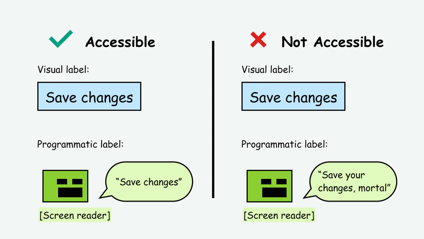
It’s important to provide a consistent experience for people who both use a screen reader and look at the screen. If the visual label is different from the programmatic label (which is the label that the screen reader accesses) then this can feel confusing.
This does not apply to icon-only buttons, since they have a programmatic label but not visual text label.
This references WCAG criterion 2.5.3 Label in Name (Level A).
Level AAA compliance is considered more difficult to meet because it requires more resources to fulfill. It also might encompass conflicting access needs (meaning what is accessible to some might be inaccessible to others). Use your best judgment of your target audience and your team's capabilities to determine if this is a pragmatic goal to reach.
How to Implement This
The programmatic label appears in the markup of an interactive component, often as an ARIA-label (Accessible Rich Internet Applications). For example:
<button aria-label="save changes">Save Changes</button>
In order to be accessible, the phrasing should be the same (though the capitalization and punctuation is not as important, as the programmatic label will be read out loud by the screen reader).
If the labels are inconsistent, this is confusing and inaccessible. For example:
<button aria-label="save updates to database to ">Commit</button>
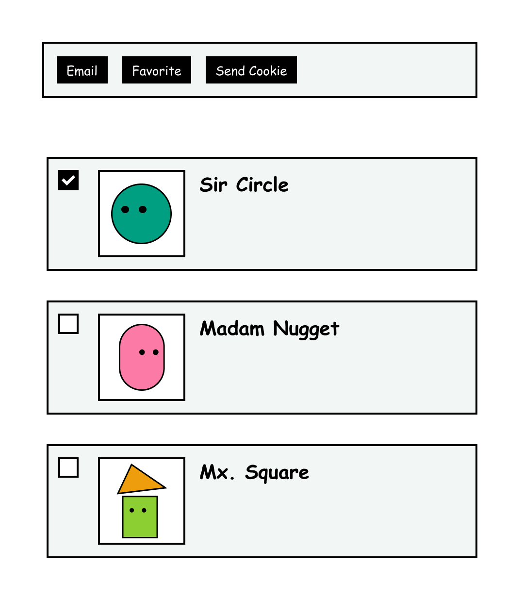
The one exception to this rule may be in the case where repeating buttons appear in a list of elements. For example, in a list of people, you have the option to email, favorite, or send a cookie to anyone in the list.
In this case, the people’s names should be headers so that screen reader users can easily browse through the items. That way, they can also associate the buttons with the name. If it is still confusing which person the button is referring to, you can also add supporting text to the programmatic label, for example “send cookie to sir circle” instead of just “send cookie.”
While this example technically creates different programmatic and visual labels, it might be necessary to prevent confusion depending on the context and audience.

However, if the inconsistency between the visual and programmatic label ends up being more confusing, you can always add repeating buttons to a toolbar and use selection controls (such as checkboxes) to select the item you are referencing.

How to Test This
- Use automated testing tools such as Deque Axe and IBM Accessibility Checker to determine if the programmatic label is present.
- Use tota11y’s screen reader wand to hover over elements and see if the programmatic label matches the visual label.
- Recommended to conduct user testing with screen reader users who also visually look at the screen.